The Medallion Data Architecture (Pros & Cons)
Nov 20, 2025
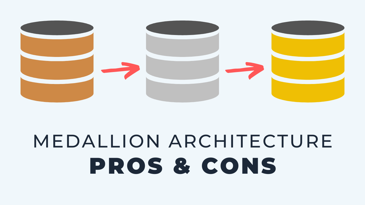
A medallion architecture is a way of organizing a data pipeline into three levels: bronze for raw data landing untouched from the source, silver for cleaned and transformed data, and gold for the business facing objects your BI tools and models read. It is a popular pattern and it gets two things very right, an isolated landing zone and a separate presentation layer. Where teams get stuck is silver, because most of the work happens there and nobody is sure how many steps it should contain or where the line with gold sits. I usually describe the same pipeline with plainer names instead: raw, staging, warehouse and marts. The result is identical, and the naming argument disappears.
Key takeaways
- Medallion architecture is bronze, silver and gold: raw landing, transformation, and presentation.
- Bronze is a landing zone with no transformations applied. You just drop the data there.
- Gold is the presentation layer, the data marts that BI tools and machine learning read from.
- The isolated landing zone and the separate presentation layer are the two best parts of the pattern.
- Silver is where teams get confused, because most of the processing lives there and the line with gold is blurry.
- A common sticking point is facts and dimensions. I put them in silver, and I have seen teams build them in gold.
- Plain names like raw, staging, warehouse and marts get the same result with less to explain.
What a medallion architecture is
It sounds simple when you describe it, and plenty of the teams I talk to still struggle to implement it. They are not sure whether they are building things at the right level, the names get confused, and the whole thing ends up more complicated than it needs to be.
Here is the shape of it.
- Bronze. The raw landing zone. No transformations, you just drop data there as it arrives. If you think in lakehouse terms, this is the data lake part.
- Silver. Where transformation logic is applied: filtering, cleaning, enriching, applying schema.
- Gold. The presentation level. Business facing objects that connect to BI tools and machine learning.
That is the whole pattern. Three levels, data moving left to right through them.
Where it fits in the bigger picture
Before going deeper, it helps to zoom out to what I call the three pillars of data engineering. If the medallion layers feel confusing, this reframes what you are actually doing.
- Sources. Internal databases, business applications, files, APIs, whatever the business runs on.
- Insights. Reports, context, decisions. The reason any of this exists.
- The central hub. The middle, where raw data gets prepared into something you can draw insight from.
A medallion architecture is one way to implement that central hub. It is not the only way, and remembering that keeps the conversation in proportion.
It is easy to get lost in the details of a pipeline and forget that the whole job is turning sources into insights. Zooming out this far is how I keep the layer debate in proportion.
The flow in one line
Sources load into bronze untouched. Bronze is transformed into silver, often with dbt doing that work. Silver is reshaped into gold for reporting.
What the pattern gets right
I like a lot about this, and two parts in particular.
An isolated landing zone
Having a dedicated space where everything lands first keeps things in order. Batch loads and streaming loads arrive in the same place.
It is also where you can do a lot on security and standards, because there is one clear boundary around the untouched data.
One place for everything arriving means one set of access rules to manage, rather than permissions scattered across whatever schema each source happened to land in.
A real presentation layer
Gold gives you a separate place for data marts, cleanly divided from the transformation work happening behind it.
Reporting connects to that layer and nothing else. Presenting the data that way, as its own deliberate layer, is a very good idea.
Shared vocabulary
Common terminology matters too. Bronze, silver and gold give people words for the same ideas, which makes design conversations faster.
Where teams get stuck
The drawbacks all cluster in the same spot, and it makes sense: silver is where most of the processing happens.
Silver has no agreed shape
Some teams build multiple steps and several layers inside silver. Others have one big diagram and no internal structure at all.
Either way there is uncertainty about how it should be organized, and that uncertainty is the thing that slows people down.
The silver and gold line is blurry
Teams are often unsure what counts as silver and what counts as gold. The simplest example is facts and dimensions.
My view is that facts and dimensions belong in silver. I have seen plenty of teams build them in gold instead, and everyone does this slightly differently.
Naming the objects, not just the ideas
The lines blur most in dbt projects. How do you structure things so the databases and schemas match the dbt project, and should the objects actually be named bronze, silver and gold in the warehouse?
Maybe the answer is yes. But that question is where I see the terminology create more confusion than it resolves.
The three layer model I use instead
Here is the alternative, and it is very similar. Same concepts, same outcome, different names.
Being too obvious can sound boring, but it is more effective and much easier to explain to people.
Raw
Instead of bronze I call it raw. It is the same landing zone, and nobody has to ask what the word means.
I usually keep the whole thing inside one database rather than spreading it out.
Staging
Staging holds one to one representations of the raw tables, lightly cleaned up. No real transformation yet, just a tidy version of each source table.
Warehouse
The warehouse layer is clearly facts and dimensions. There is no ambiguity about what belongs here, which is exactly the problem silver has.
Marts
Then the presentation layer, the data marts. These are what feed BI tools, machine learning, AI tools and reverse ETL, the same role gold plays.
Which one should you use
This is a matter of personal preference, not right and wrong. The medallion pattern is not a bad idea, and plenty of teams I work with already follow it or want to.
When they do, these layers map onto each other directly, so you can hold both conversations at once.
- Bronze is raw. The landing zone, untouched source data.
- Silver covers staging and warehouse. One to one cleaned views first, then facts and dimensions.
- Gold is marts. The presentation layer feeding BI, machine learning and reverse ETL.
My own hesitation is that the extra naming adds a layer I do not need, especially once database objects and dbt project folders have to line up with it. What matters in the end is turning sources into insights. How you label the stops along the way is a debate worth having quickly and then settling.
Key terms
Medallion architecture
A pipeline pattern that moves data through three named levels, bronze for raw, silver for transformed and gold for presentation.
Bronze layer
The raw landing zone where source data arrives with no transformations applied, equivalent to what I call the raw layer.
Silver layer
The level where filtering, cleaning, enrichment and schema are applied, and the level teams most often struggle to structure.
Gold layer
The presentation level containing business facing data marts that BI tools, machine learning and other consumers read from.
Three layer data model
My alternative naming for the same pipeline: a raw landing zone feeding staging, then a warehouse layer of facts and dimensions, then marts.
Common questions
What is the difference between bronze, silver and gold?
Bronze is untouched source data in a landing zone. Silver is where cleaning, filtering, enriching and schema application happen. Gold is the business facing presentation layer that reporting and machine learning connect to.
Should facts and dimensions be in silver or gold?
I build them in silver, and treat gold strictly as the presentation layer of marts assembled from them. Teams do put them in gold and it works, but then gold is carrying two jobs at once. Pick one convention and apply it everywhere.
Do I have to name my database schemas bronze, silver and gold?
No, and this is where the terminology causes the most friction. Some teams name objects after the layers, others only use the words in conversation. Either is fine as long as the dbt project structure and the warehouse schemas agree with each other.
Is the medallion architecture the same as a three layer data model?
Functionally, close to it. Raw maps to bronze, staging and warehouse together cover what silver does, and marts are gold. The difference is naming and how explicitly the middle is broken down.
Why do teams struggle with the silver layer?
Because it absorbs almost all of the work and the pattern does not say how to organize it. You can end up with one enormous step or a sprawl of sub-layers, and neither is obviously wrong, which is what makes it hard.
Related reading
- How to Create a 3 Layer Data Model Pipeline
- Fix Your Data Pipeline, From The Start
- The True Value of a Data Presentation Layer
- Data Architecture with dbt: Putting It All Together
Final takeaway
Across the client projects I have set up, the layers themselves matter far more than what you call them. Get an isolated landing zone and a real presentation layer in place, decide once where facts and dimensions live, and the medallion label becomes optional.
Additional Free Resources
Starter Guides & Checklists
Explore additional free resources built on the same patterns I use with real clients so you can build your own with structure and confidence. Topics include data architecture, modeling and more specifically for small data teams.